About the Project
For this research project, My team and I were responsible for performing a range of studies to gather information pertaining to the MSU Digital Scholarship Lab's website. The Digital Scholarship Lab (DSL) is a technologically enhanced environment and collaborative space that is geared towards students and faculty. Some of the different features of the space are a lab, with many PC’s offering Adobe Creative Suite and other assistive softwares, a Digitization room for converting hard copies of text into digital formats, a 360 room, a VR room, and a “flex space”, which is an open space that can be used to hold lectures, or provide a study environment for students.
The project started with a stakeholder meeting, outlining some major goals, which were to learn how users of the spaces, both digital and physical, interact with these environments and suggest adjustments to the website in order to optimize usability and organization of content.
Interviewing
For our first phase of research, we developed a standardized sheet of background and interview questions. We decided to interview participants both inside and outside the DSL spaces. We also sent out an online survey to collect additional results.
From analyzing our data from interviews with MSU students online via Google Docs, we came up with three main findings:
1) Participants do not feel like the space in the DSL is approachable.
2) Participants were mainly using the website to look up DSL space hours
3) Participants felt that the website was lacking in pictures of the space.
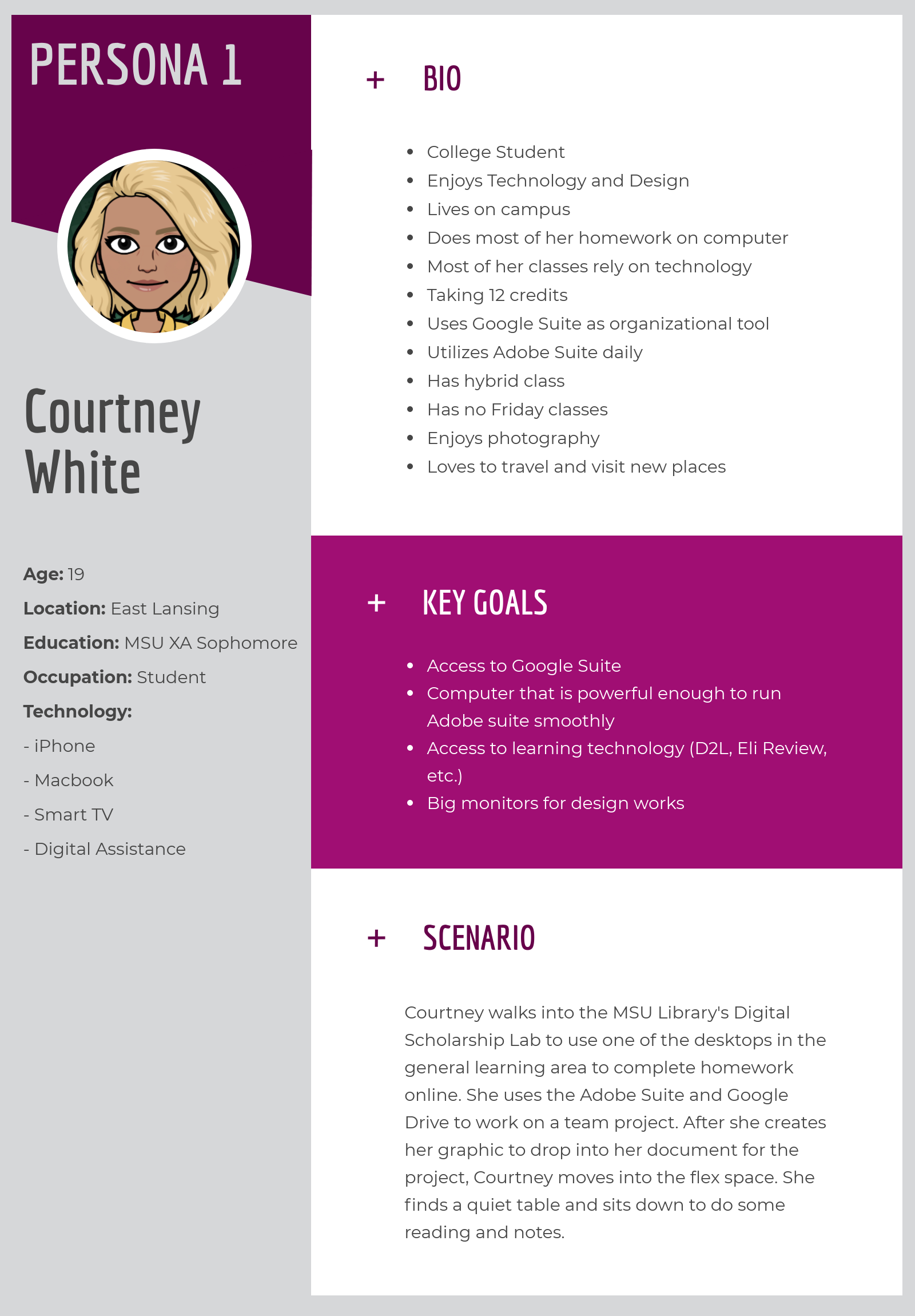
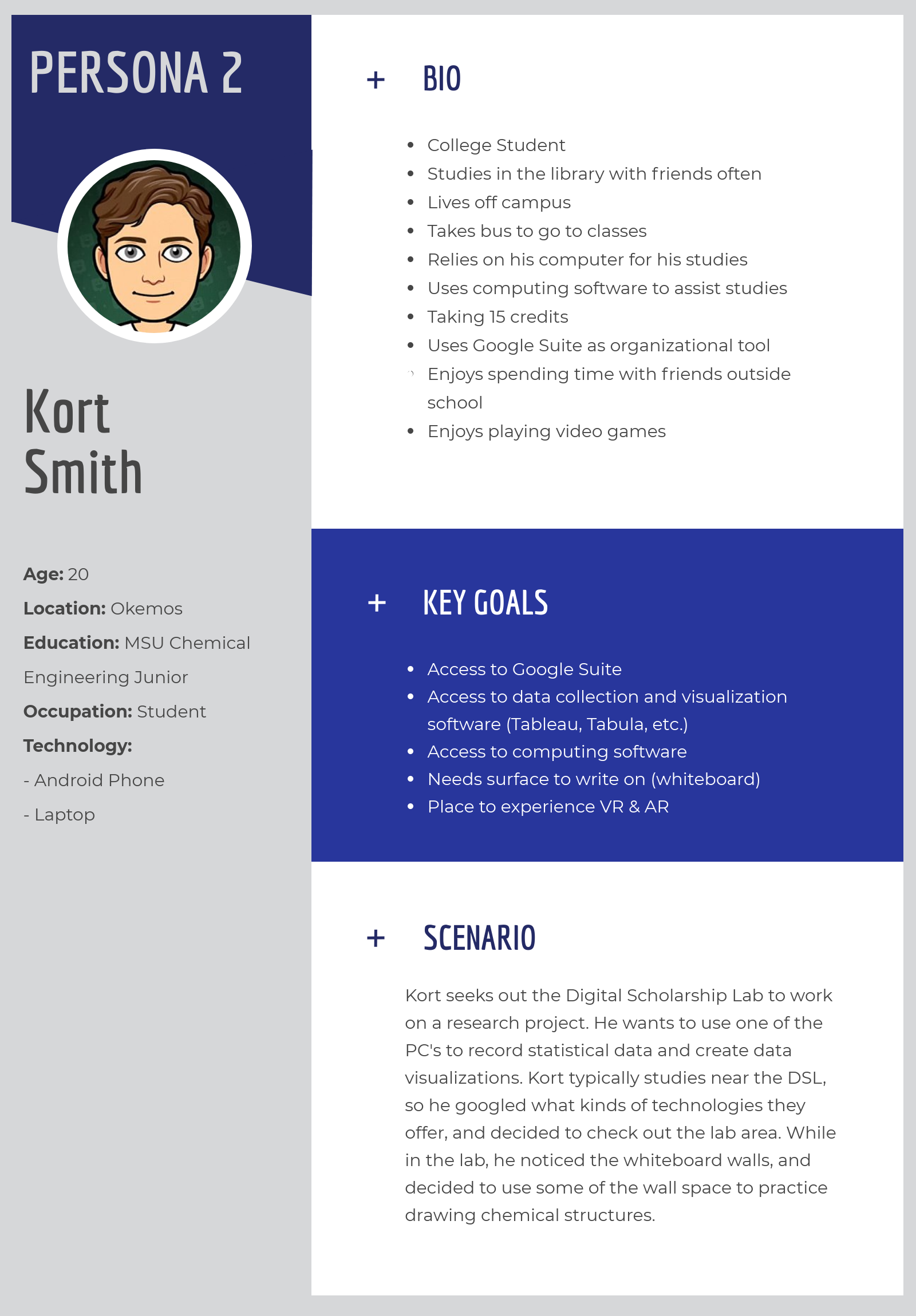
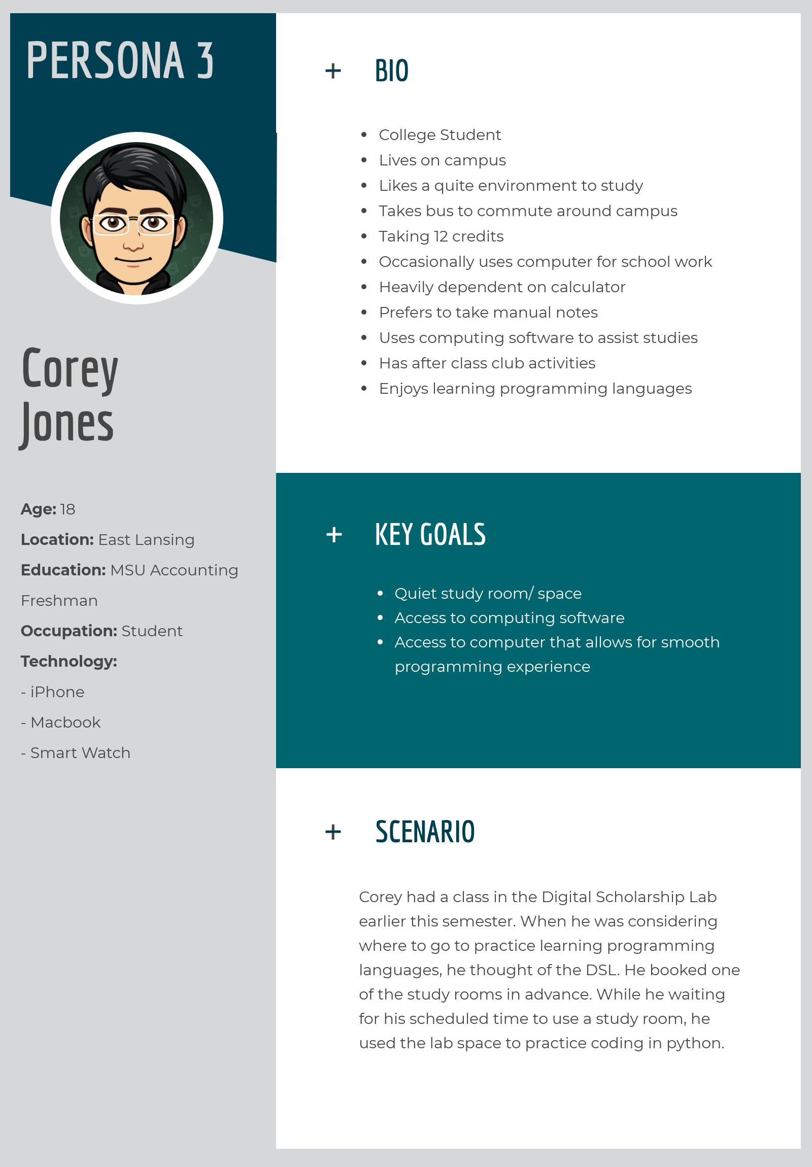
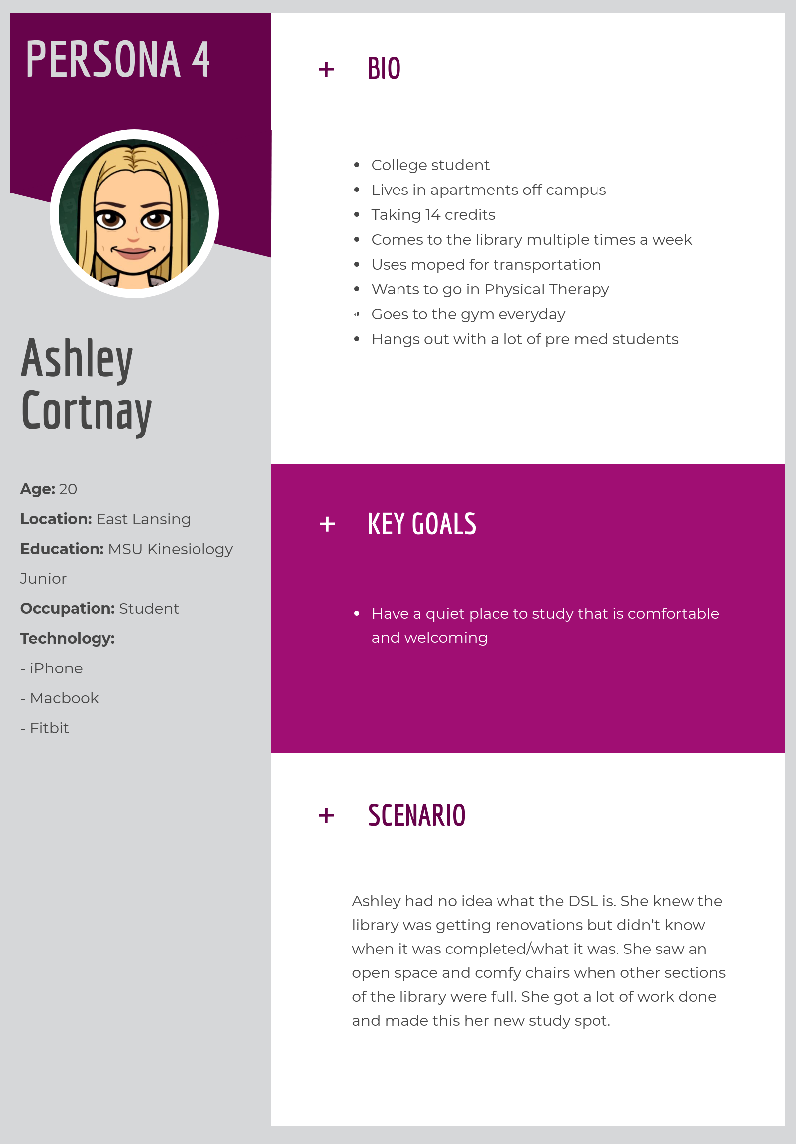
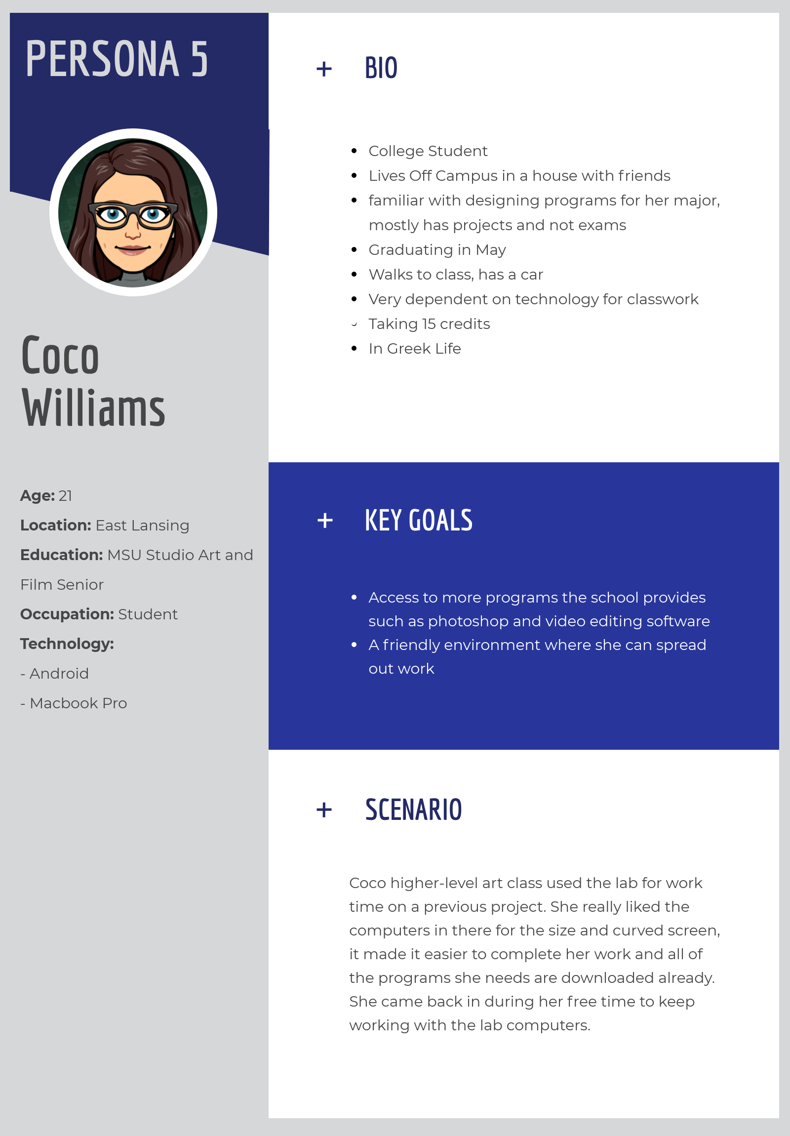
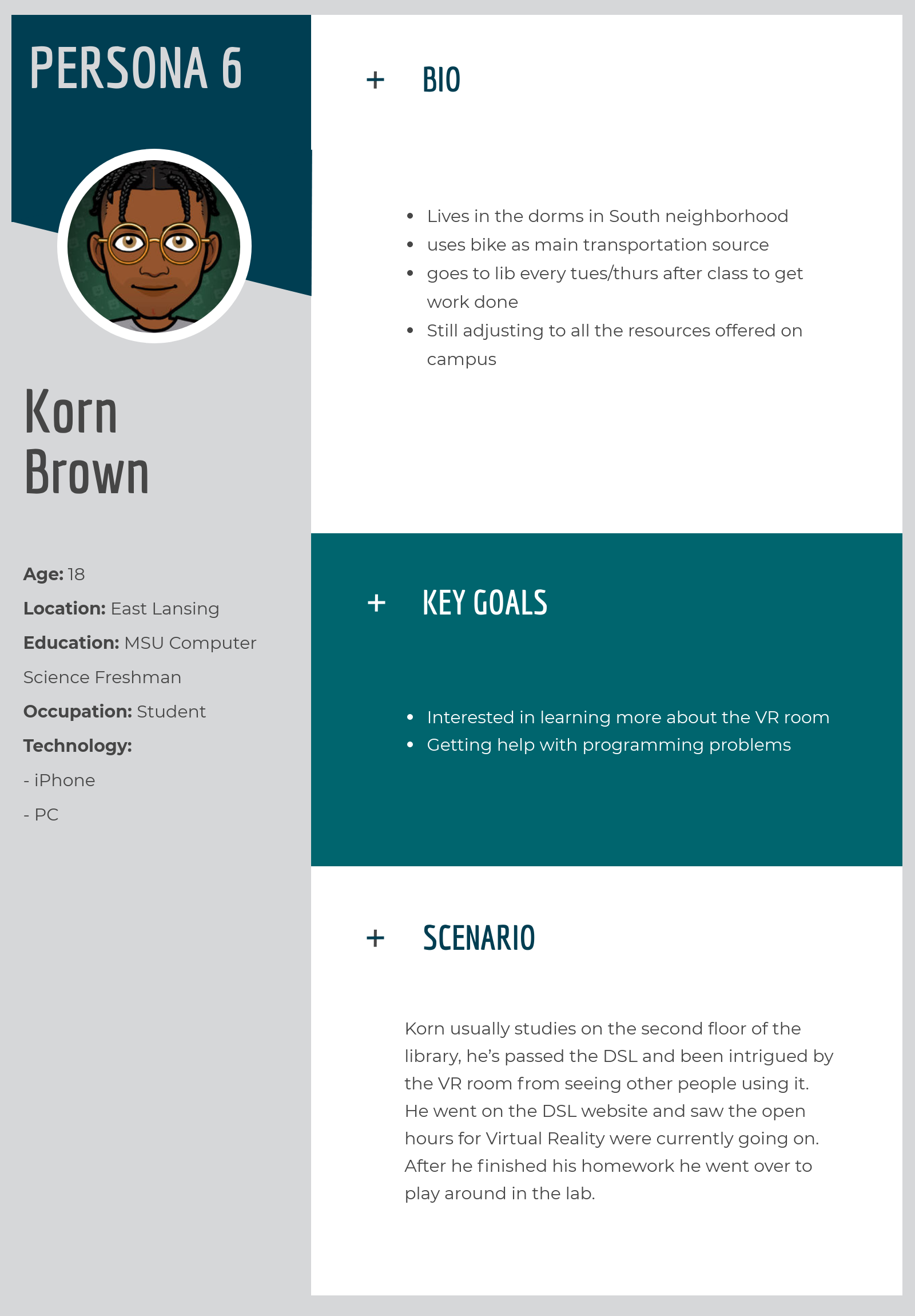
Personas
From our interview background questions, we created a set of personas and subsequent use cases for potential visitors of the DSL. From our personas we gathered a short list of user values / motives:
- Finding out about available technology
- Accessing available technology
- Accessing assistive technologies
- Accessing study spaces
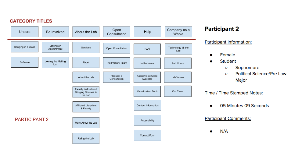
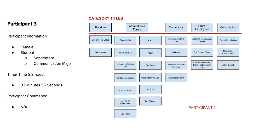
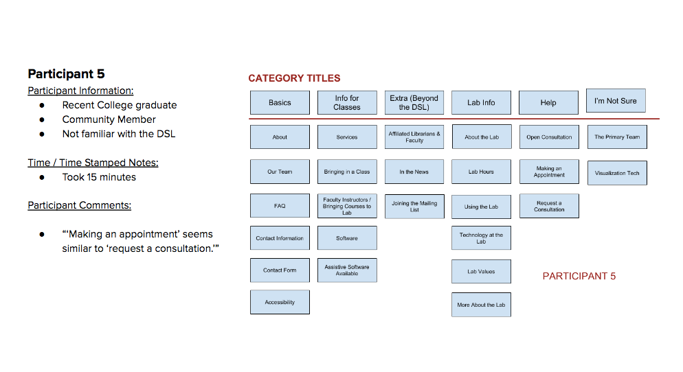
Card Sorting
For our card sorting activity, we created a physical open card sort, and an online hybrid card sort activity. Much like the interviewing phase, a standardized set of background questions and protocol were set, and remained consistent throughout the studies. Below are the results of our physical card sort activities.


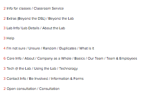
Below are the categories from our online hybrid activity that were similarly placed, with their number of occurrences listed in red. We used these results to re-organize the sitemap and reconsider navigation. In re-grouping categories based on results, we renamed content categories to use for navigation.
Heuristic Analysis
This phase of research was an in-depth analysis of the DSL website based on Jakob Nilsen's 10 Usability Heuristics. Each team member completed their individual assessments, and a meeting was held to average ratings and discuss discrepancies. Below is a graph of our combined findings.

From this phase of research, we gathered that the areas of highest need are:
- Navigation
- Basic Design
- Organization of Page Content
Competitive Analysis
For this phase of research, we selected direct, analogous and indirect websites to conduct this heuristic analysis on. We chose the following heuristics for this phase:
- Visibility of system status
- Match between system and real world
- Consistency and Standards
- Recognition rather than recall
- Flexibility and efficiency of use
- Aesthetic and minimalist design
- Help and documentation
This phase was conducted in the same manner as the competitive analysis. Pictured below is a graph of our results.
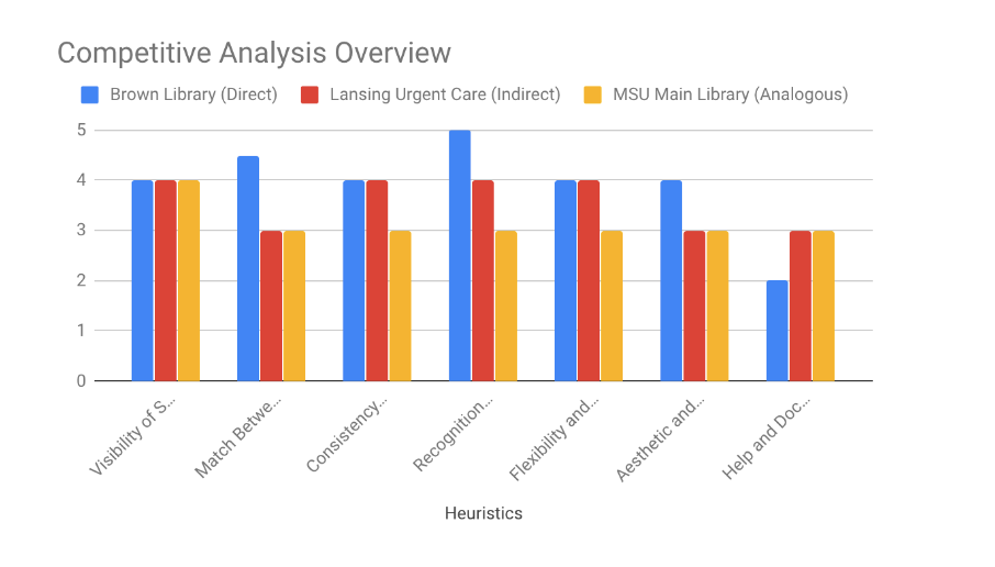
In conducting this study, we were able to gather a list of features that contributed to our ease of interaction and overall enjoyment. These features included static navigation bars, simplistic images, minimalistic page organization, and prioritized contrast and spacing.
Final User Testing
Using all of the data that we had collected, our team aggregated a final list of recommendations and began sketching out wireframes to mitigate potential issues that we had uncovered. These wireframes were then converted into a low-fi semi-interactive prototype. The prototype only included pages that we wished to modify for the purpose of streamlining our user testing, and collecting relevant data.
This prototype was linked as an attachment to a survey of questions about the prototype related to navigation, ease of use, overall aesthetic, etc. This survey was sent to the MSU Experience Architecture and Professional Writing program's listserv to gather a wide range of results.
From this survey, we learned that the majority of users enjoyed the prototyped format. Users found that navigating our prototype was extremely easy. We also learned that most users prefer minimalistic page designs, and traditional static navigation bars.
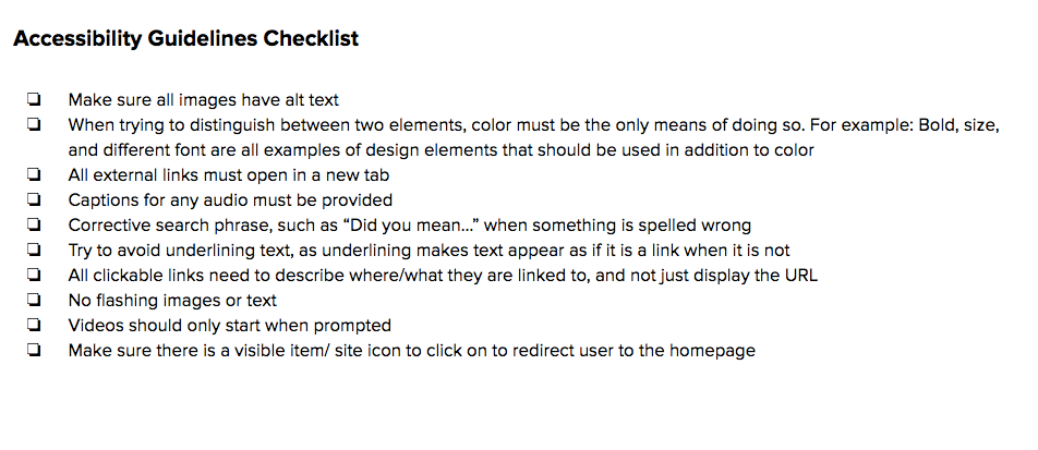
Accessibility / A11y
Below is a checklist that we created to ensure that any content or future changes to the MSU Digital Scholarship Lab's website will be optimally accessible.
Below, on the left is the previous color palette that the DSL's website utilized. On the right, we created a new palette of colors that were complaint with MSU's branding standards.

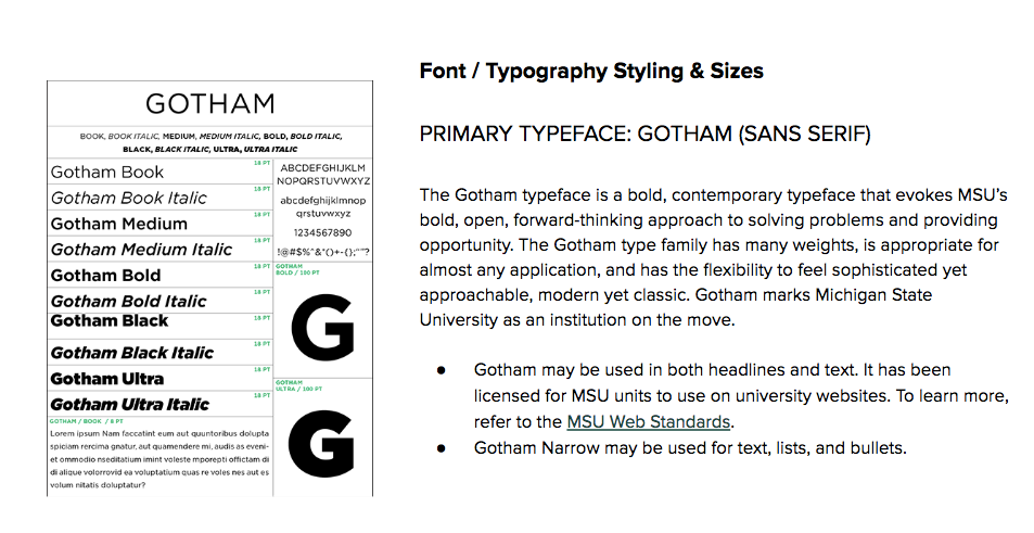
Similarly, we used MSU's web branding standards to select an appropriate font choice for the DSL site, to ensure that it remains consistent with other MSU sites.
Final Recommendations
Our final recommendations to stakeholders included the following:
1) Reorganize navigation bar to make it more intuitive
2) Create a standard FAQ layout for the FAQ page
3) Update typography and color scheme to coincide with university branding
4) Include more icons and images
5) Create consistency among page layouts